How to Choose a Color Scheme for Your Home That Feels Warm and Inviting
Choosing the right color scheme for a home can feel overwhelming, especially with so many options to consider. A well-chosen palette ties rooms together, creates mood, and makes the space comfortable. The key is to select a few colors that flow well throughout the house, balancing personal style with how the space will be used.
Many start by focusing on main areas like the living room or entryway, then pull colors from those spaces to create harmony in the rest of the home. Using tools like the color wheel or starting with a favorite item—such as a pillow or painting—can make this process easier and more personal.
Understanding how colors affect mood and choosing tones that suit daily life helps create a home that feels just right. This guide will share simple, practical tips anyone can use to find a color scheme that fits their home perfectly.
Essential Steps for Choosing a Color Scheme
Choosing the right colors for a home involves understanding basic color theory, assessing the space and light, and matching colors to personal style. These steps help create a balanced and inviting environment that fits both the room and the homeowner’s taste.
Understanding Color Theory and the Color Wheel
Color theory is the foundation for choosing a color scheme. It explains the relationships between colors using the color wheel, which groups colors into primary, secondary, and tertiary categories.
Designers often use color families—groups of colors with similar tones to create harmony. Examples include:
- Monochromatic palettes (different shades of one color)
- Complementary colors (opposites on the wheel, like blue and orange)
- Analogous colors (neighbors on the wheel, such as green, blue, and teal)
This knowledge helps avoid clashing colors and creates a balanced look. Understanding color temperature (warm vs. cool tones) can also affect the mood of a space. Warm colors often feel cozy, while cool colors create calmness.
Evaluating Your Space and Natural Light
The amount and type of natural light a room receives greatly influence color selection. Bright spaces can handle darker or more intense colors, while darker rooms benefit from light, reflective shades to open up the space.
Consider the direction your windows face:
- South-facing rooms get warm light all day and can use cooler colors to balance.
- North-facing rooms have cooler light and usually look brighter with warm tones.
Walls, floors, and furniture color should work together in one color scheme. Light colors can make small rooms feel larger, while bold hues add depth to big spaces.
Identifying Personal Style and Interior Design Preferences
A color palette should reflect personal style and fit the overall interior design theme. Someone who prefers modern decor might choose minimalist, neutral shades with strong accent colors. In contrast, rustic styles may lean toward warm earth tones.
He or she should think about the feeling they want each room to evoke, such as calm in a bedroom or energy in a kitchen. Collecting inspiration from photos or mood boards can help spot favorite colors.
Mixing favorite colors with advice on harmony leads to a cohesive color scheme. The goal is a home that feels both stylish and comfortable to live in.
Applying Color Schemes for a Harmonious Home
Choosing colors that work well together creates balance and makes rooms feel connected. Understanding how different schemes work, using a simple rule to divide colors, and picking the right paint and wallpaper help make a home look polished and inviting.
Types of Color Schemes: Monochromatic, Analogous, and Complementary
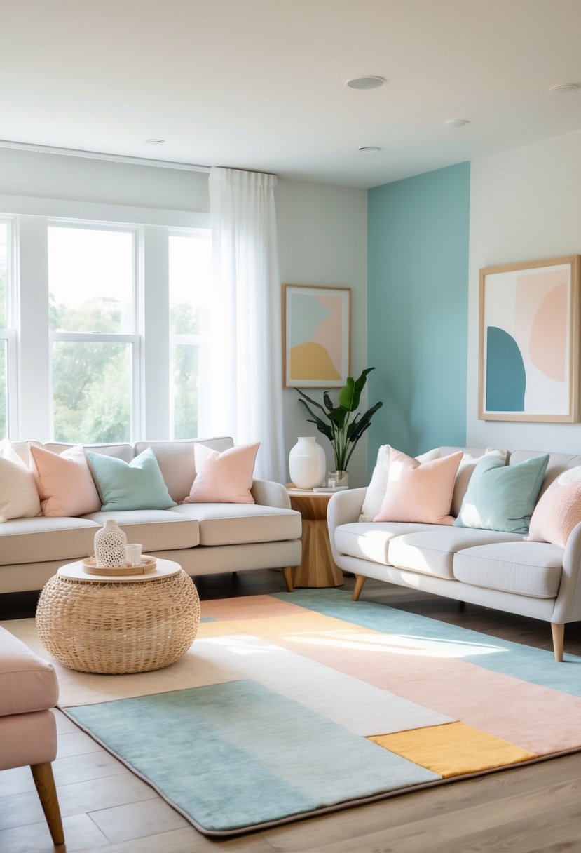
A monochromatic color scheme uses variations of one color with different shades, tints, and tones. This creates a calm, unified look. For example, pale blue combined with navy and soft sky blue gives depth without clashing.
An analogous color scheme pulls colors that sit next to each other on the color wheel, like green, yellow-green, and yellow. These colors blend easily because they share undertones. This scheme feels natural and cozy, perfect for living rooms or bedrooms.
Complementary color schemes pair colors opposite each other, such as blue and orange or red and green. These provide high contrast and vibrant energy. To avoid overwhelming a space, one color can be dominant while the other acts as an accent color in pillows or art.
The 60-30-10 Rule for Balanced Color Use
The 60-30-10 rule is a simple way to balance colors in a room. It suggests:
- 60% is the dominant color (often a neutral or wall paint)
- 30% is the secondary color (furniture, larger decor pieces)
- 10% is the accent color (small, bold details like cushions or lamps)
This rule helps use warm colors or cool colors in the right proportion. For example, a soft gray (60%), navy sofa (30%), and mustard yellow pillows (10%) keep the room balanced and interesting without feeling chaotic.
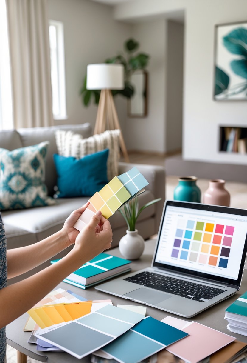
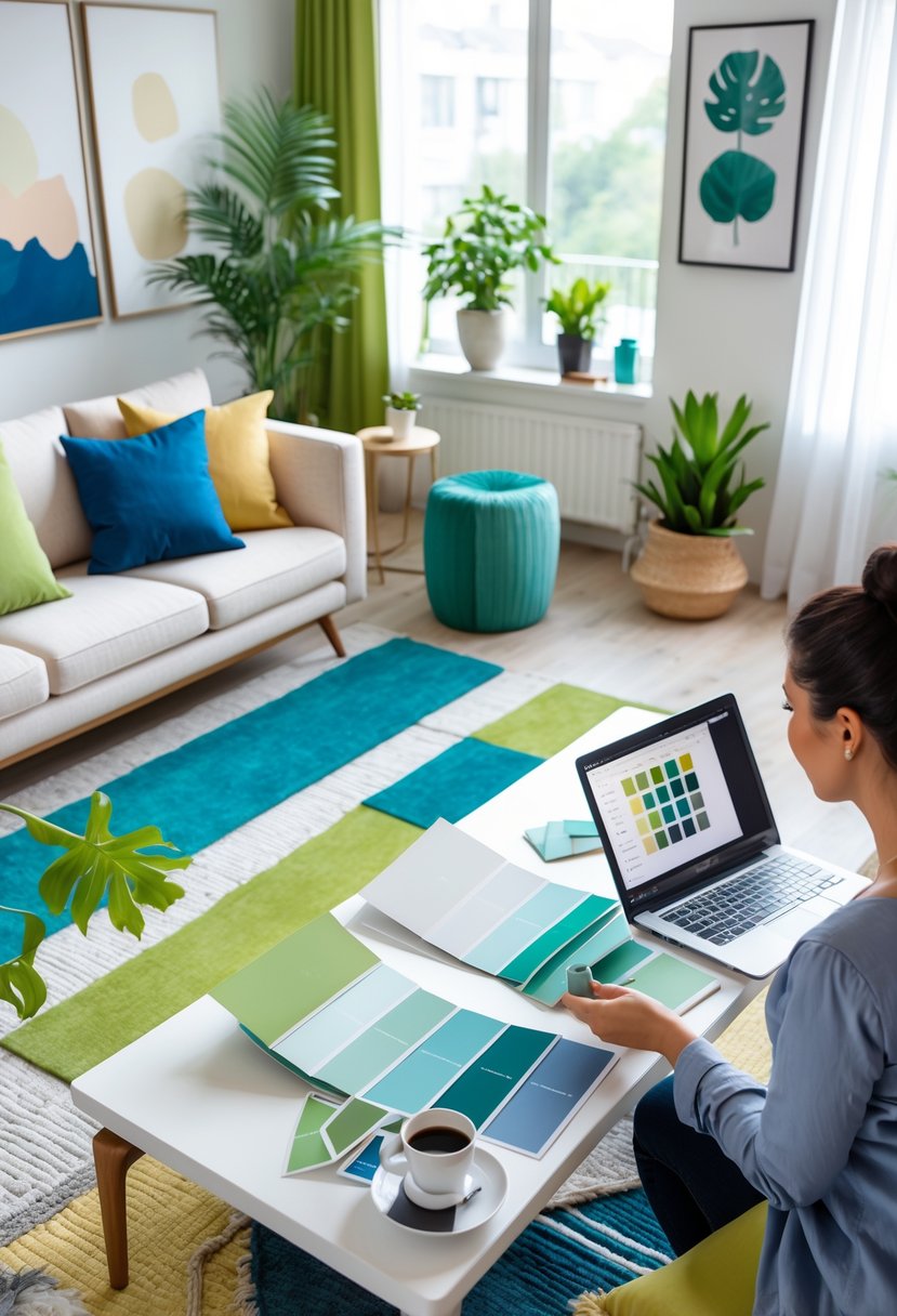
Selecting Wallpaper, Paint Swatches, and Accent Colors
Start by picking paint swatches that work in natural and artificial light. Test swatches on different walls to see how colors change at various times of day. Consider architectural features like moldings or built-ins to highlight with a contrasting paint or wallpaper.
Wallpaper can add texture and pattern, acting as a bold statement or subtle background. Choose patterns in the same color family as your paint to keep harmony. For small rooms, light wallpaper with cool colors can open the space.
Use accent colors in accessories like rugs, cushions, or artwork for pops of contrast. These accents can be drawn from secondary colors or tertiary colors that complement your main palette, tying everything together visually.
Frequently Asked Questions
Choosing the right colors can be easier with helpful tools and examples of classic palettes. Visual aids and proven color combos can guide decisions and reduce mistakes.
What tools are available to help visualize potential color schemes in a home before making a decision?
There are several apps and websites that allow users to upload photos of their rooms and apply different paint colors virtually. Tools like color visualizers help see how lighting and undertones affect paint colors in the actual space.
Some paint brands also offer free samples and swatches that can be tested on walls to view the color at different times of day. This hands-on approach gives a clearer idea before making a final choice.
What are some timeless color combinations for home exteriors?
Classic pairings include white trim with navy blue or dark gray siding. These colors provide a clean, sharp look that fits many styles.
Another popular option is beige or taupe walls paired with deep green or black shutters. Earth tones with contrasting accents create a welcoming and balanced exterior that lasts over time.